Eastern Divide Brewing Packaging
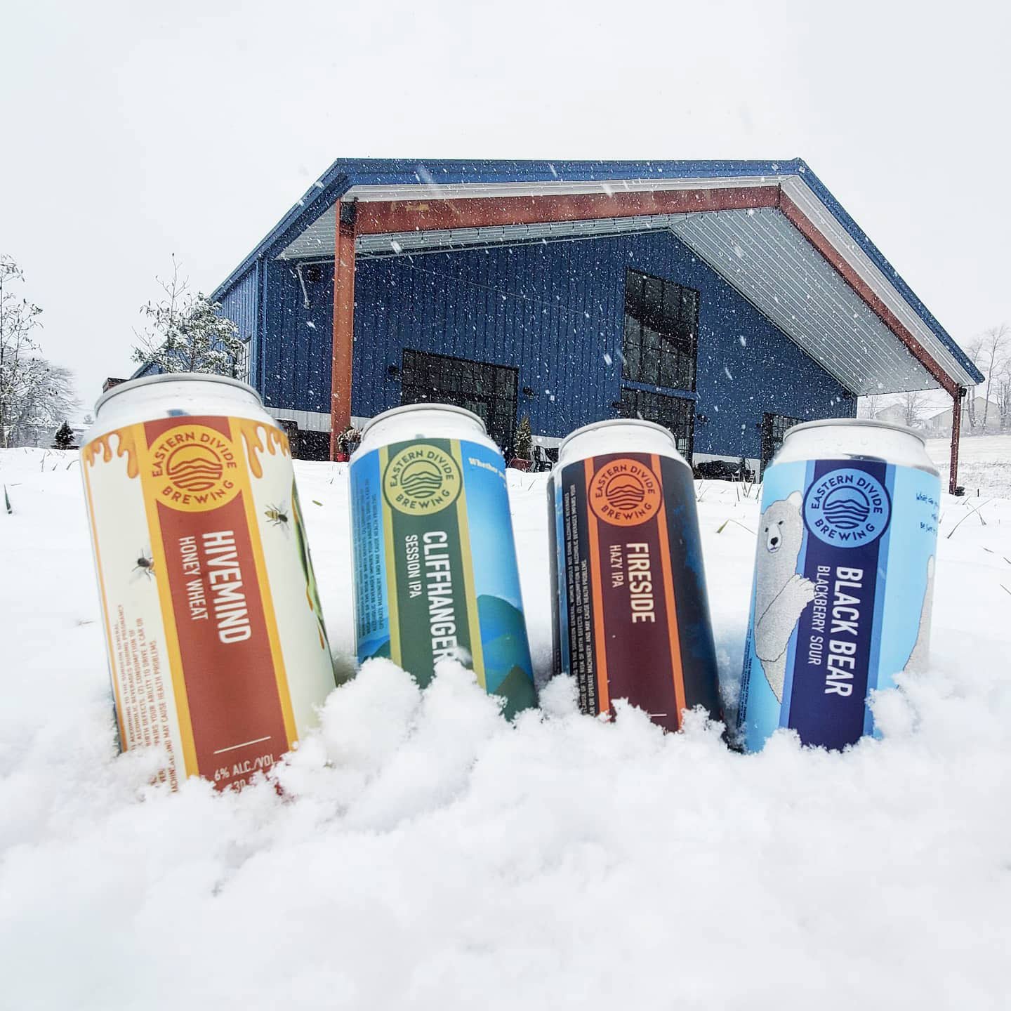
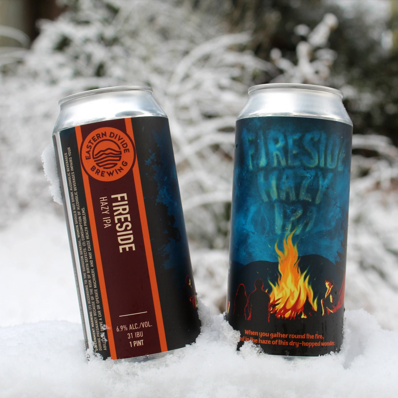
Eastern Divide Brewing Company decided to begin canning their beers to offer customers easy 4-pack to-go options and have begun selling their beers in stores throughout Virginia. I developed a label-design system and a series of illustrations for each of their canned beers. Because the client wanted to have illustrations featured for each design, I chose to develop a vertical band design for the primary text, which maximized the illustration area. The vertical band colors change based on those used in the imagery. For their “secondary” illustration style, Eastern Divide embraced funky outliers and humor. The illustration for Hivemind Honey Wheat was based on a sketch the brewer, Brandon Roberson, had done for the menu signage.


Eastern Divide wanted to have a “primary” illustration style, which we describe as a retro travel poster aesthetic. Their location-based beers follow this style (seen here are Indie Park Ale and Cliffhanger). Each location that has been selected is based along the Eastern Divide. For example, the image on Cliffhanger Session IPA is an illustration of McAfee’s Knob, a popular hike (with spectacular views) on the Appalachian Trail.
The imagery on Indie Park Ale is a bit closer to home, in that it is based on the highway exit sign you’d see when you arrive in Blacksburg, Virginia. The brewery itself is located within an industrial park (hence the name Indie Park).

For the Black Bear Blackberry Sour, I chose to illustrate sour (grumpy) black bears, with lips stained from eating too many blackberries—and they, of course, are also drinking Eastern Divide beers.
Each of the 2020 illustrations include a bit of an Easter egg. Hidden somewhere on each can is the shape of the Eastern Continental Divide line (e.g. it is the central crack in the skull on Hivemind and it takes the shape of one of the mountains on Cliffhanger).


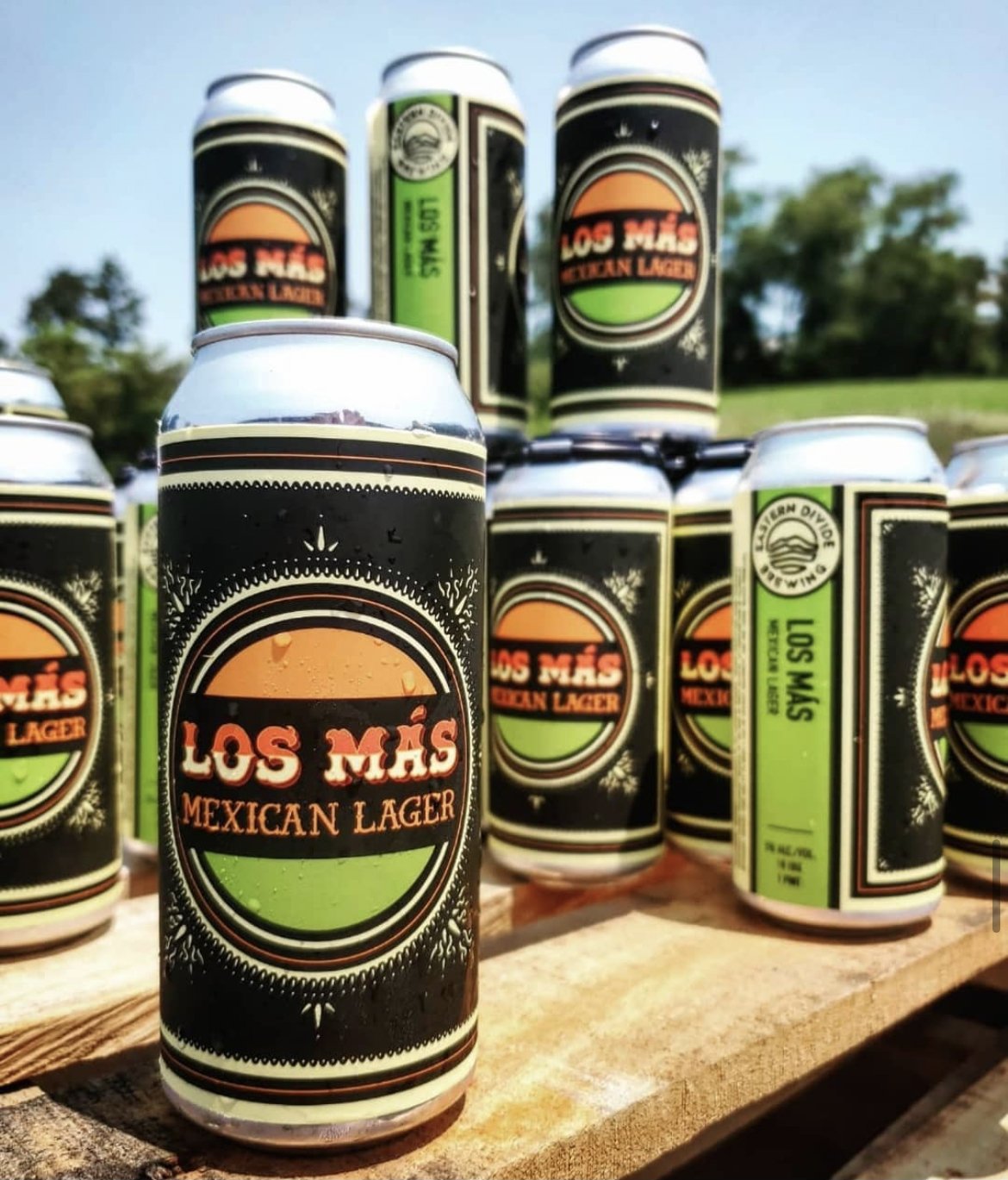
Los Mas is a tribute to their taproom director Sam Sol. Literally translated “los mas” means "the more" or "the most." I hand-lettered the type to have the feel of a painted signboard and used high-energy colors to bring in the joy of summer.
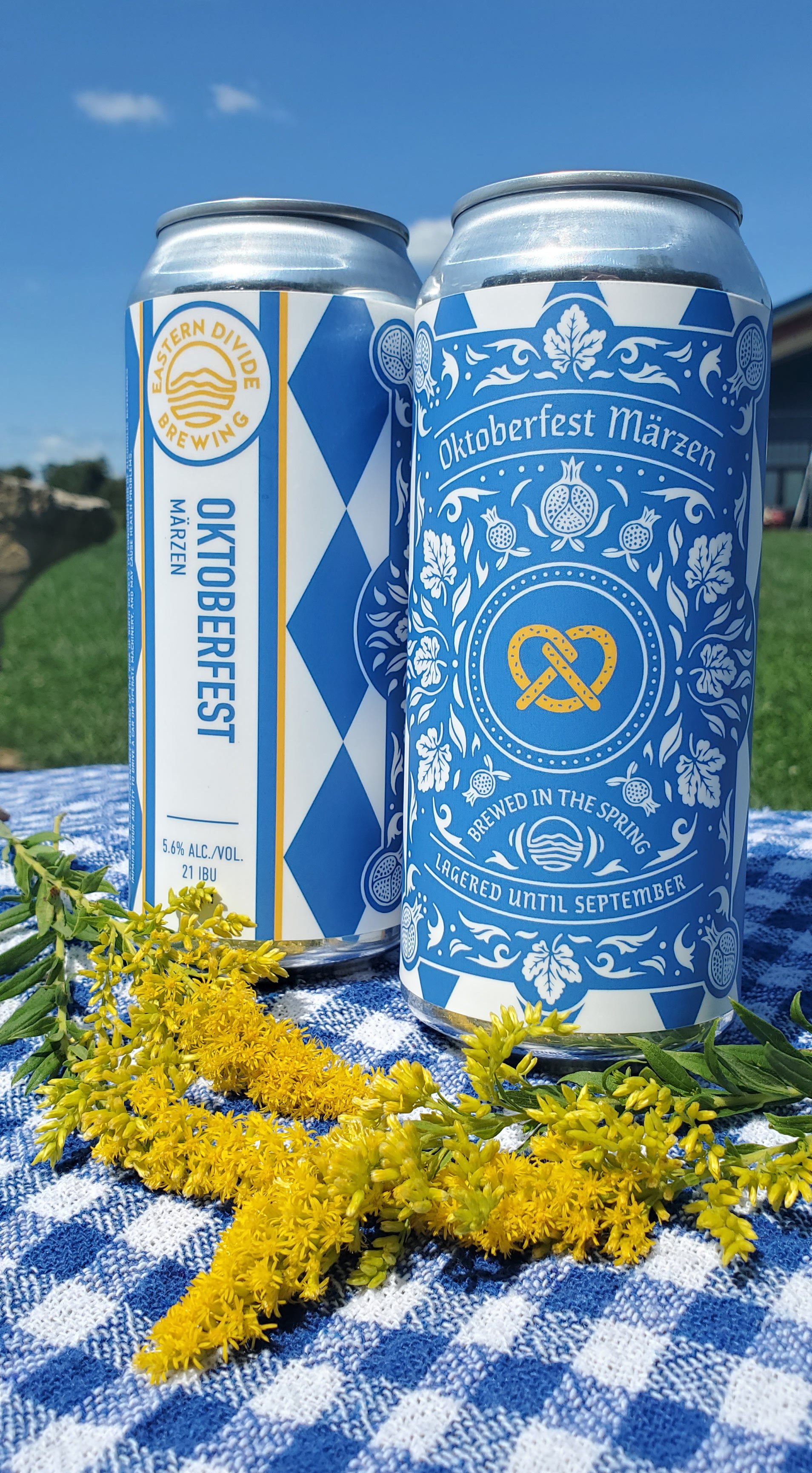
For the Oktoberfest Märzen, I illustrated fall leaves in a pattern surrounding a pretzel (because what Oktoberfest celebration is complete without a giant Bavarian pretzel?). The blue and white and diamond pattern reinforces the connection to Oktoberfest and help make the can design easily recognizable.
Cliffhanger, Fireside Hazy IPA, and Los Mas each won “American Package Design Awards” from Graphic Design USA.
The 2020 designs (Hivemind, Cliffhanger, and Black Bear Blackberry Sour) received “Best in Print” for the 2021 Western Virginia Advertising Awards, from the American Advertising Federation. They also received a Gold ADDY for Illustration Series and a Gold ADDY in Packaging. The 2020 designs also received a Silver for Illustration and a Bronze for Packaging from the Indigo International Design Awards.
The 2021 designs (Commerce Street, Fireside Hazy IPA, Oktoberfest, and Los Mas) received a Silver in the 2022 Western Virginia Advertising Awards.


